

Your Web3 product has everything: revolutionary technology, solid tokenomics, and an engaged community. But your conversion rate is stuck at 2%.
The problem is likely (drum roll, please)... your interface.
Poor Web3 UX design is costing you users. While traditional crypto UX focused on technical functionality, converting users today requires interfaces that balance security with simplicity.
As a Web3 design agency, we've audited dozens of products, and the same Web3 UX mistakes appear again and again. Most are designed like they're built for developers by developers, with everyone else as an afterthought. The technology might be groundbreaking, but the Web3 UI design creates barriers so steep that people bounce before they even connect their wallet.
If you're serious about optimizing your Web3 website for conversion, you need to address these fundamental design issues.
Let's break down the five problems killing your conversion rates and how to improve the Web3 user experience.
Your design system has more personalities than your Discord server.
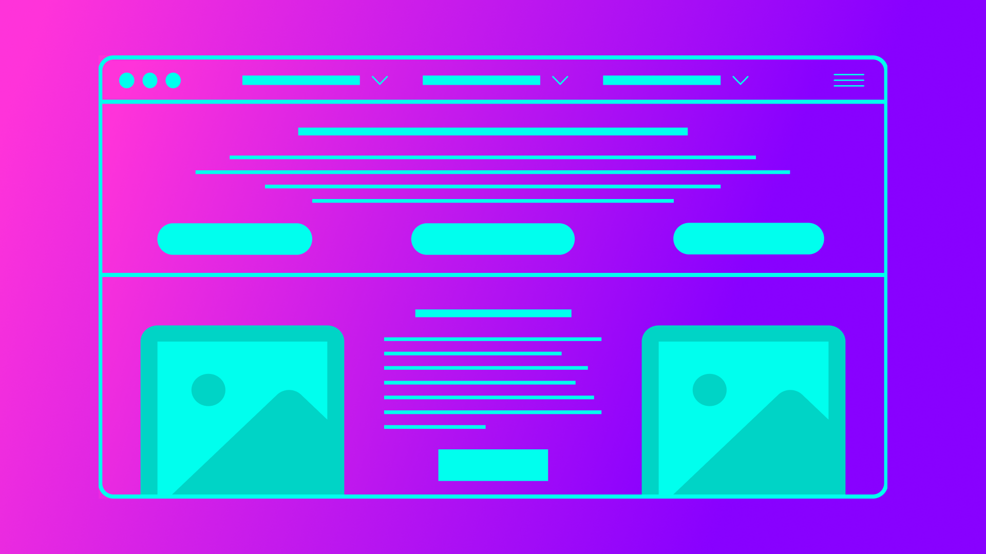
Buttons change size between pages. Colors shift. Typography is a free-for-all. One section looks like a DeFi dashboard, another like a gaming platform, and somehow the footer ended up looking like it belongs to a completely different company.
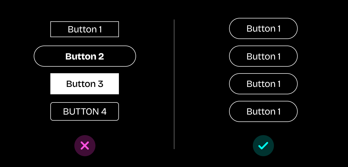
For Web3 brands, trust is your scarcest resource. Users are already on high alert for scams, phishing sites, and rug pulls. When your design feels inconsistent, it triggers every red flag they've been trained to watch for. That visual chaos reads as amateur operation or worse (think “malicious actor.”)
This is one of the most common crypto UI design mistakes because teams focus on shipping features fast without establishing design foundations. Inconsistent design does more than confuse users. It makes them suspicious. And suspicious users don't convert.
How to fix it:
Consistency builds the trustworthy foundation your product needs.
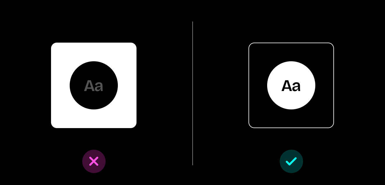
Dark mode dominates crypto aesthetics. And while dark interfaces on DeFi platforms and decentralized applications can look great in screenshots, they're creating a cascade of problems: illegible text, contrast ratios that fail accessibility standards, eye strain, and brand inconsistencies that make your product feel like every other crypto dashboard.
When users can't read your copy, they can't understand your value proposition. When everything blends into the dark background, they miss your CTAs. When your low-contrast design gives them eye strain, they close the tab.
This Web3 UX mistake costs you conversions because you're designing for aesthetics rather than usability. Real humans need to actually use your product in bright offices, on sunny terraces, on phones with auto-brightness fighting your UI choices.
How to fix it:
These accessibility improvements directly impact your ability to improve Web3 user experience across all user segments.
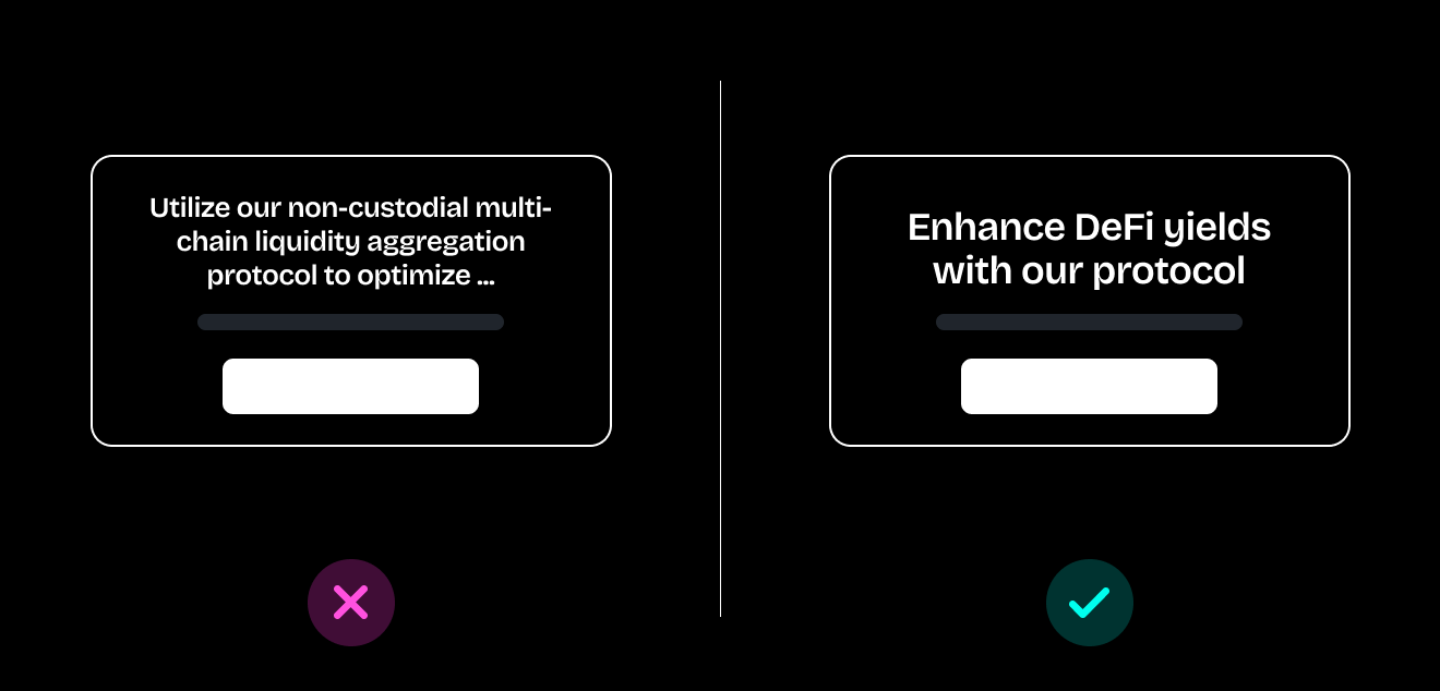
"Utilize our non-custodial multi-chain liquidity aggregation protocol to optimize your DeFi yield strategies across heterogeneous blockchain environments."
Cool. Cool, cool, cool. Now explain it like you're talking to a human who doesn't spend 16 hours a day on Crypto Twitter.
Web3 products are drowning in developer jargon, technical specs that belong in documentation, and feature lists that read like GitHub commit messages. You're optimizing for the 1% who already understand everything while alienating the 99% who don't.
People don't buy products they don't understand. From complicated wallet connections and complicated onboarding processes, every piece of unexplained jargon adds friction. Every technical specification without context creates hesitation. Clear communication builds bridges; technical jargon builds walls.
This content-focused Web3 UX mistake prevents even interested users from converting because they can't parse what you're actually offering.
How to fix it:
Clear, accessible language is essential for Web3 website conversion optimization because it removes friction from the decision-making process.

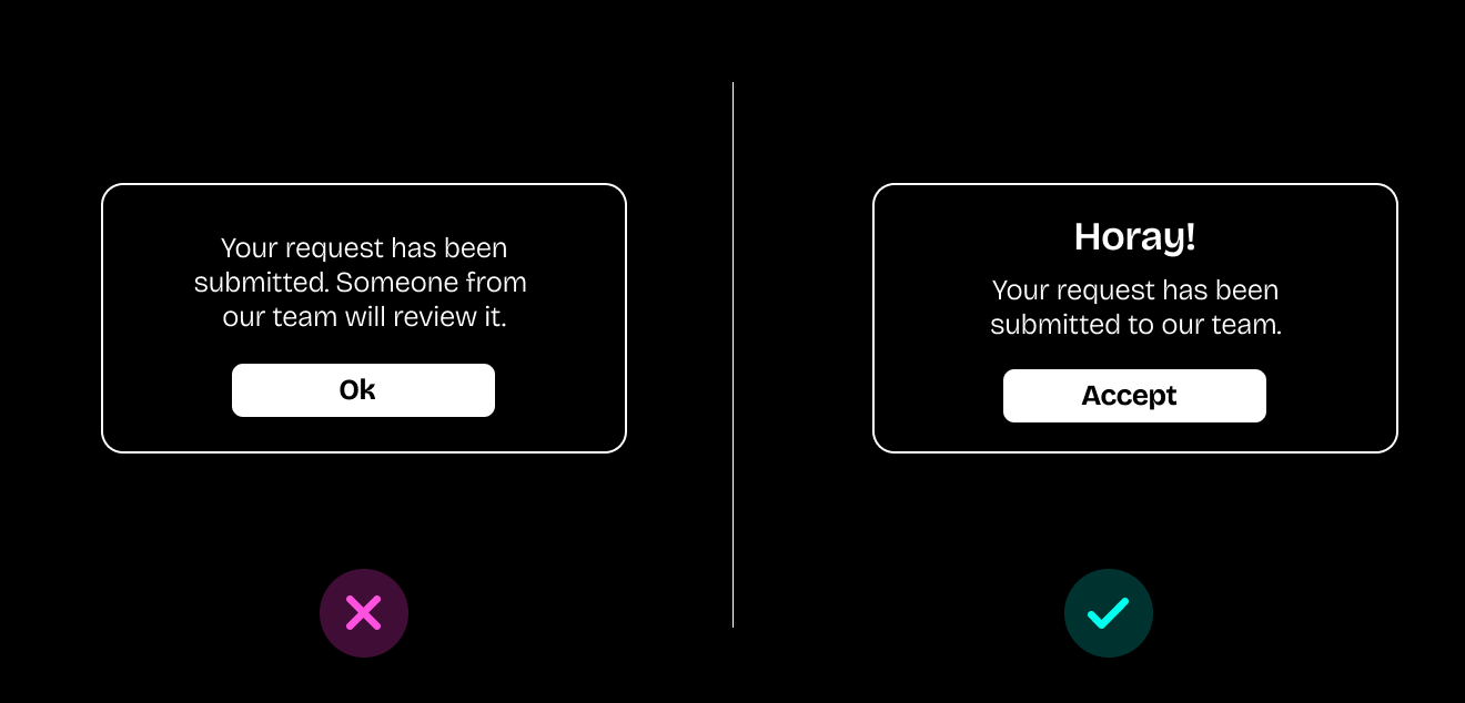
Your product has dozens of buttons on the home screen, navigation menus that spawn sub-menus that spawn more sub-menus, onboarding flows that take 15 steps, and no clear indication of whether anything actually worked when users click.
Users are spending their cognitive load on navigation instead of on your actual product.
Users shouldn't need a treasure map to understand your product. When your information architecture is chaos (overlapping categories, inconsistent naming, random organization, unclear hierarchies), people exhaust their mental energy trying to navigate. They never get to engage with what makes your product valuable.
And the absence of feedback makes things worse. Buttons without loading states, actions that fail silently, and uncertainty about whether transactions went through. In crypto, that uncertainty doesn't just frustrate users. It scares them away.
These combined Web3 UI design mistakes create a user experience that actively discourages engagement and conversion.
How to fix it:
Treat your interface like what it is: a guide. These improvements directly improve Web3 user experience by reducing cognitive load and building confidence.
Your UI might be technically functional. It has the right elements in the right places. It accomplishes its core tasks.
But it feels like... nothing.
No personality. No storytelling. No emotional design. No visual hierarchy that guides attention. No copy that sounds like it came from humans. Just cold, efficient, personality-free interfaces that make users feel like they're operating machinery rather than joining a movement. This affects user engagement across all segments, from crypto natives to newcomers.
People connect with movements and ideas, not just protocols. When your interface lacks soul, you're competing purely on features and price. Someone will always build a cheaper, more feature-rich version.
But when your design has personality, when it tells a story, when it creates an emotional connection, that becomes defensible. That's what builds community, not just users. This subtle Web3 UX mistake undermines long-term retention and community building, even if your initial conversions seem acceptable.
How to fix it:
You're building for people. Make your product feel like it.
Web3 promised to rebuild the internet with users in mind. But if your users need a computer science degree and a high tolerance for visual chaos to navigate your product, you're building an exclusivity club with a steep barrier to entry.
Great UX/UI design makes things work. For everyone. Even (especially) for the people who aren't already crypto natives.
The protocols that win won't just have better technology. They'll combine that technology with better design. They'll make blockchain feel accessible, trustworthy, and genuinely enjoyable to use.
Avoiding these common mistakes helps ensure Web3 website conversion optimization that moves your business metrics. Each improvement also compounds to improve the Web3 user experience across your entire funnel.
Start with one area. Fix your feedback states. Simplify your navigation. Test your contrast ratios. Add some personality to your copy. Each improvement compounds.
Your technology deserves design that matches its ambition.
Want help turning your interface from intimidating to intuitive? Let's talk about building Web3 UI that people actually want to use. Because revolutionary technology deserves revolutionary design.
Build the future of Web3 with people who get you. No suits required. Memes encouraged.

.png)


.png)