Polkadot Reimagined:

Pink is the New Block

Polkadot - 2024
We supercharged Polkadot's aging brand with bold colors, human-centered design, and accessible language that matches its vibrant community energy.
Polkadot needed a glow-up

Context & Challenge

After six years, Polkadot’s visual identity was showing its age—oversaturated with diagrams, a flat palette, and generic tech vibes. Meanwhile, the community was more alive than ever. Builders building. Memes memeing. Energy high.


The challenge? Make the brand match the vibe.
Bold or bust

Approach

Embrace bold colors. Make blockchain feel human. Distractive went all-in on a brand refresh with a design language and tone of voice that flexes across everything from hacker house merch to enterprise decks.


Our guiding principle: a brand should capture the energy of its community, not just explain its technology.

Long live the dot:


If Web3 is building the future, shouldn’t it look and sound like something real people want to be part of? By leading with bold visuals, human-centered design, and accessible language, we’ve created a visual toolkit that’s as flexible as Polkadot’s technology.

Pixels, pink, and people

Implementation

Here’s how we rewired how Polkadot feels:

  • Color, turned all the way up: We dialed up Polkadot’s signature punchy pink and embraced bold gradients to break the typical crypto aesthetic and spark emotion.
  • Humans front and center: Real photography grounds the tech. Because building the future of the internet isn’t just about code—it’s about people.
  • Copy that connects: We transformed technical jargon into playful, accessible language that's informative and true to the tech without being boring.
  • Visuals that flex: From memes to milestone reports, the new brand system adapts across content types and tones.
  • Brand assets built for the ecosystem: Projects can now plug into the Polkadot visual system without losing their own identity. It’s not a top-down brand—it’s a shared language.
Ecosystem energy: matched

IMPACT

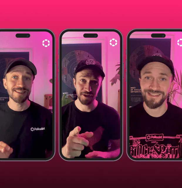
This wasn’t just a facelift—it was a full-spectrum reimagining that transformed how Polkadot presents itself to the world. The brand refresh delivered:Here’s how we rewired how Polkadot feels:

  • A visual identity that finally reflects the energy of its builders, users, and community
  • A flexible messaging framework that scales from meme campaigns to enterprise-grade materials
  • Visual assets and guidelines that empower the ecosystem to build without asking for permission